Institutional racism and deaths in the front line.

“Its the National Health Service not the International Health Service.” Matt Hancock.

Charity begins at home, but solidarity, by definition, doesn’t.

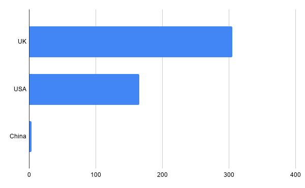
The disproportionate fatality rates among BAME front line workers in the Health Service is clear and shocking (1). Matt Hancock’s assertion above, and the Conservative election leaflets promising to “protect the NHS” by limiting immigration are shown up as the mean spirited disgrace they are by the deaths of so many doctors, nurses and health care support workers who have been sent into work without adequate PPE with the same insoucient carelessness with which the Conservatives have dealt with the Grenfell fire – before and after. The figures for Doctors are particularly overwhelming.

chart (7)
Death rates among Doctors and Dentists


chart (8)
BAME proportion of workforce: Doctors and Dentists

The sheer number of Doctors and Dentists from BAME communities should be enough for those benighted sections of “the white working class” unwilling to extend solidarity beyond their own ethnicity to reflect that the “immigrants overwhelming the health service” are largely the people who are working in it and a huge proportion of the people we are clapping and cheering for every Thursday night. The horrifying number who are dying in the front line of this crisis should be something to make them show a bit of respect, if they can tear themselves away from that latest bit of online Sinophobia from Tommy Robinson.

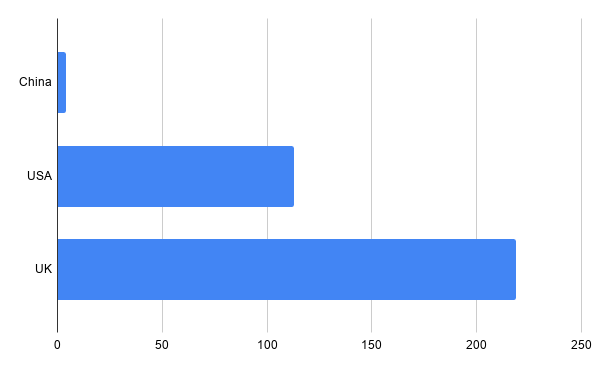
The disproportion is even more stark for BAME Nurses and Midwives, who are 20% of the workforce but 71% of the fatalities.

chart (9)
Death rates among Nurses and Midwives
chart (10)
BAME proportion of workforce: Nurses and Midwives

And Healthcare support workers, who are 17% of the workforce and 56% of the fatalities.

chart (11)
Death rates among Health care support workers
chart (12)
BAME proportion of workforce: Healthcare support workers


Caroline Nokes MP Minister for Government Resilience and Efficiency in 2017, said this in relation to emergency preparation.

‘Resilience does not come easily but the UK has long experience. Call it what you will, but whether through the fabled ‘stiff upper lip’, ‘Blitz spirit’ or just a stubborn determination, our resilience can be seen at the forefront of our handling of emergencies.’

This is essentially an admission that they never bothered to be prepared on the basis that “British pluck” would make up for an absence of PPE stocks, testing equipment, emergency systems set up and ready to go. The savage irony of all this narcissistic nationalist mythology is that the most resilient communities in the country, those that have had to deal with the Windrush scandal and the hostile environment, are those that have also had to “take it on the chin” in the coronavirus crisis too. The old normal – that we are “all in the same boat’ but, as in the Titanic, some are in first class with access to lifeboats looking down their noses at the people in steerage without, and thinking they should be damn grateful to be on the boat at all – has carried its way through this crisis. We cannot allow it to define “the new normal” too.

Remember the dead. Remember their names (2). Fight for the living. PPE for all. No end to the lockdown without WHO conditions being applied in full.

(1) The figures in this blog come from this recent study. https://www.hsj.co.uk/exclusive-deaths-of-nhs-staff-from-covid-19-analysed/7027471.article

(2) All are listed here. https://thinklab.com/ToryFibs

Who can you trust?

The UK government’s explanation of why it has decided to stop comparing the UK’s Coronavirus infection and death rates with China’s is deeply ironic. They say that Chinese stats can’t be trusted.*

There is a more obvious explanation; that China has been very successful in keeping its death rates down while the UK has not, that this is deeply embarrassing, and becoming more so as time goes on.

This is what that looks like in deaths per million as of April 26 (1).

. chart (5)

This is significantly worse than the previous week. The Chinese figure is unchanged (on 3.3 per million) – because the virus is under control – while the US and UK figures deteriorate (from 101 to 168 per million for the US and from 206 to 305 per million for the UK) (1). This figure means that the Chinese can now start to safely reopen their economy. It is quite clear that the UK and US cannot do so safely at this level. Denial is essential to even contemplate doing so. ** Whitewashing out the discrepancy with China, is a further aspect of playing down or ignoring their experience and any lessons that could be learned from it – could be preparing the ground to do so at an unsafe level.

The trustworthiness of UK official figures is also questionable. While the daily death rate is confined to those who have died in hospital after being tested and serves a purpose in tracking trajectory, it does not include anyone who has died anywhere else; and no one in government is keen to point out that the headline figure is not the total of people who have actually died: which is considerably larger. This may be considered a sin of omission, but it nevertheless serves a purpose in downplaying how bad things actually are; another form of denial.

Financial Times analysis (2) incorporating the Office for National Statistics figures on all deaths concluded that the official UK figure of 17 337 deaths up to Tuesday 21 April is less than half the actual figure. That looks like this.

chart (4)


*This is odd, because the WHO does trust them (as does the Financial Times; whose job it is to provide accurate information for the business class). A logical next step in this trajectory will be to downgrade relations with the WHO – which also serves a purpose in that it stubbornly insists on tighter conditions for easing lockdown’s than the UK government is prepared to contemplate. See previous blog.

**It is clear that the ground is being prepared to do this. Train operating companies are preparing to open up 80% of services by May 18th. Statements by Nicola Sturgeon and Mark Drakeford on behalf of the Scottish and Welsh governments on Friday on easing the lockdown to “live with” or “live alongside” the virus indicate that a reopening is being planned that is a response to commercial, not health, pressures. When Keir Starmer says that the UK risks being “left behind” in its consideration of “exit strategy” in the context of other countries beginning to ease restrictions, this applies pressure in precisely the wrong direction. The UK has the second highest daily death rate in the world right now. As of April 25, that looks like this.

chart (6)

The points he – and the rest of the Labour and trade union movement should to be making are:

1. That the only safe exit is one in which the WHO ‘s 6 conditions are met in full and

2. That the current lockdown should be tightened to include ALL non essential work; as the quickest route to an exit is through cutting off all possible routes to infection.

3. We can no more “live with” the virus than we can live with climate breakdown.

(1) https://www.statista.com/statistics/1104709/coronavirus-deaths-worldwide-per-million-inhabitants/

(2) https://www.ft.com/content/67e6a4ee-3d05-43bc-ba03-e239799fa6ab

Do What Works.

The per capita death rates from COVID19 are expressed here in how many deaths there have been in China, the USA and UK per million people. The figures are taken from here from 15 April.

https://www.statista.com/statistics/1104709/coronavirus-deaths-worldwide-per-million-inhabitants/

The Chinese figure has been uprated from 3 to 4.5 to reflect the backdated increase in deaths in Wuhan announced yesterday. In case the figures for the USA and UK are not clear on the graph, these are; USA 101. UK 206.

While the US response is widely and rightly seen as a mess, there is a tendency in the UK to give the government far more of a benefit of the doubt than it deserves. chart (3)

It should be clear from this that China’s experience should be studied and learned from, while the UK and US are not models to be followed.

The bottom line right now is that China did not end its lockdown until deaths were in single figures. The relaxation of social distancing now being contemplated in parts of Europe and being discussed in the UK will let the genie back out of the bottle. Disaster will follow if this course is pursued. The only safe path to an exit is through a tightened lockdown.


UK daily death stats seriously understated.

Understatement is not a charming national characteristic in this case. The Office for National Statistics (ONS) – which does a weekly update to take into account the deaths that have taken place outside hospital – has just published the following.

Our data shows that of all deaths in England and Wales that occurred up to 3 April (registered up to 11 April), 6,235 involved COVID-19 compared with the 4,093 deaths reported on 4 April 2020 by @DHSCgovuk http://ow.ly/4kHD50zdo9L

So for the week ending 3 April the total Coronavirus deaths in the UK were half as high again as those being announced by the government. 6,235. Not 4,093. That looks like this. the daily totals announced in the press briefings are just the blue part of the circle. Bear the in mind every time a new figure is announced.

chart (1)

While including these on a daily basis would be very difficult – and attempts to do so in France have led to wild fluctuations in daily totals that make trends harder to discern – these additional deaths should be factored in; and the provisional nature of the daily figures made clear at the daily press briefings.

With many of the most vulnerable elderly people in particular pre-triaged not to take up hospital beds and reports of significant spread of infections within Care Homes – where staff are even less likely to have proper PPE than front line medics – this gap could well grow in the next week.

The rate at which the UK and US are taking an increasing share of the daily deaths can be seen here in the FT.  https://www.ft.com/coronavirus-latest.

My next post will look at these death rates per capita.


US and UK death rates stand out.

chart

This graph shows the totals of reported global deaths for April 10th. With the usual caveats that many places in the developing world may be under reporting – the figures for the USA and UK stand out starkly. One in three of all reported deaths in the USA. One in six in the UK.

UK daily figures only include deaths in hospital, not those at home or in Care Homes; so the actual figures will be worse; probably significantly so. The Office for National Statistics will be updating these on Tuesday, so I will do another graph to take that into account then.

Three things to note.

  • The number of deaths in China on 10 April was zero.
  • With the UK death rate projected by the IHME (1) to hit a peak on April 17th with 1 674 deaths on that day, this is not a time to be prioritising talk of “exit strategies”.
  • Those concerened with these should be studying the Chinese experience of cranking society back into life – as the only country that has began to do so an a large scale.
  1. http://www.healthdata.org/covid/updates